While browsing Hacker News, I came across this article on the Zapier blog.
I couldn’t help but notice a problem with the menu.
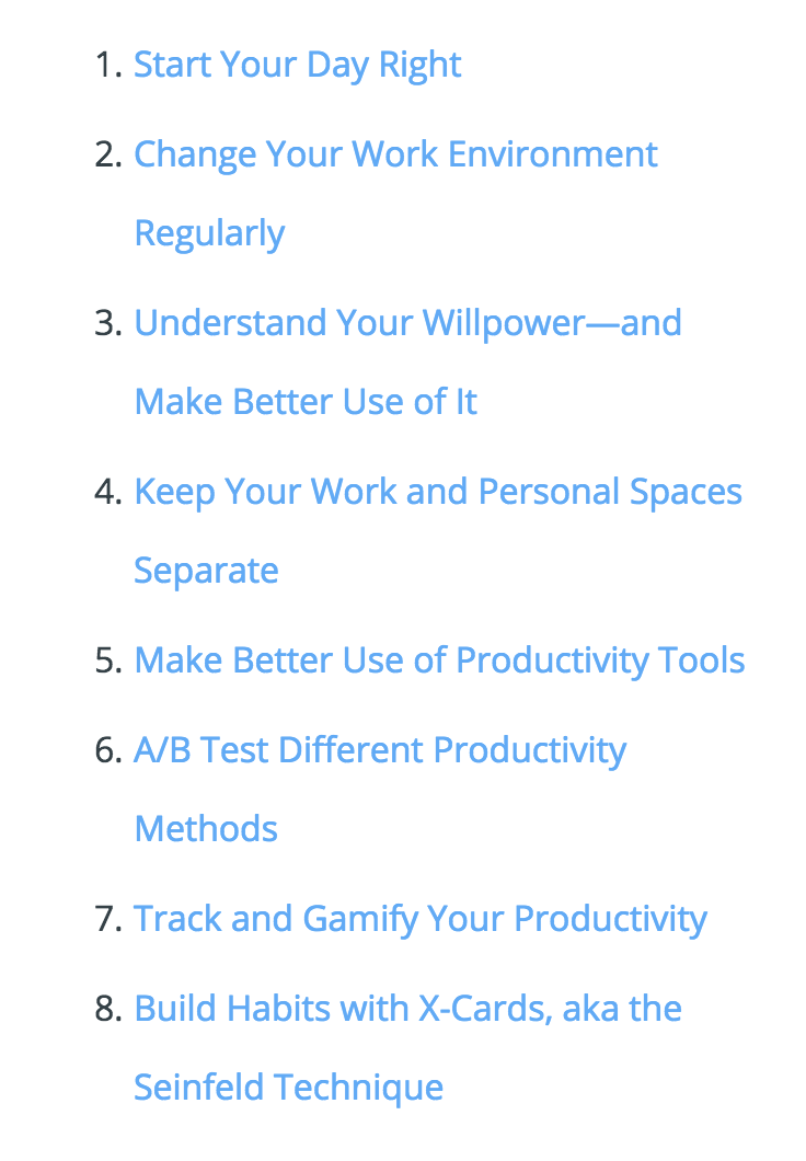
What’s the problem?
The problem? The “Click Dead Zone”.
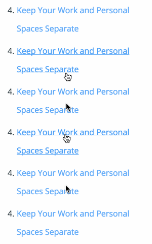
It’s not unusual to come across this problem across the Web, so I thought I’d give a simple advice!
Why does it happen?
It happens because the line-height is set to space out the list items, although it shouldn’t be used for that purpose.
.blog .content ol {
  font-size: 18px;
  line-height: 2em;
}
It’s that line-height: 2em!
Works well for a single line, but quite unreadable (and unclickable) for multiple lines.
How do you fix that?
Glad you asked! Here’s the simple rule:
line-heightshould be used for readibilitypaddingshould be used to space out the list items
Let’s say you want to keep each list item’s height to 2em.
First set the line-height to 1.2em which is readable for list items.
.blog .content ol {
  line-height: 1.2em;
}
This amounts to a 1.2em height for a single line.
We’re missing 0.8em.
Let’s split this amount equally among the padding to keep the content vertically centered.
.blog .content ol li {
  padding: 0.4em;
}
And voilà !
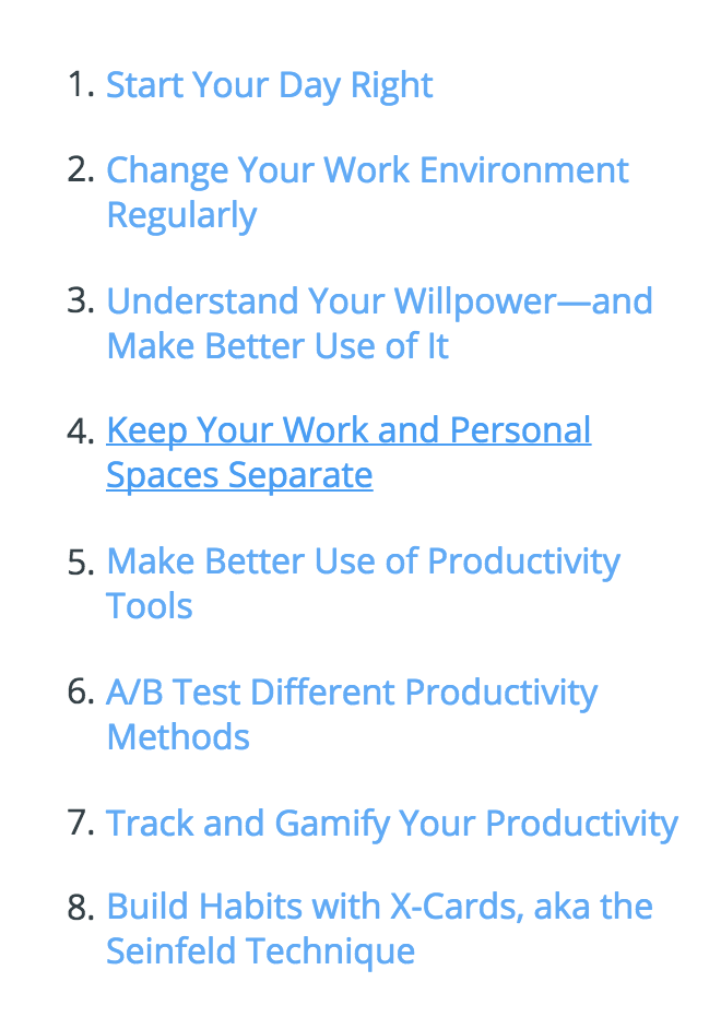
Improved readibility for multiple lines
No "Click Dead Zone"